
I’m very lucky, to have recently do na interview with award winning lifestyle designer, Kim Parker, who is collaborating with Clarke & Clarke on a stunning, colourful range of wallpapers and fabrics which will be launching at Decorex – and couldn’t wait any longer to show you a preview of their beautiful floral designs …
What is your background? How did you become an artist ?
I grew up in a home surrounded by great music, art, ballet, and a love for Nature. My family are all serious classical musicians. By the time I was two years old my parents were already saving my drawings of clowns and flowers and putting them together in a book. It was evident early on that color was a driving force for me. I used to dig my crayons deeply into the paper to get the maximum richness of color out of them. Having come from a musical family I started studying the flute by the time I was eight years old. I pursued my life as a classical concert flutist -graduating with a degree in Flute Performance from Oberlin College Conservatory of Music. I had many rich experiences as a classical musician, playing publicly in masterclasses with Jean Pierre Rampal by the time I was thirteen, and spending memorable summers playing in an orchestra at Tanglewood where I had the great privilege of working closely with Leonard Bernstein, who happened to be my musical hero. My life seemed destined for a career in music. But in between concerts and practicing, I was usually painting quietly. I would just sit for hours at my desk reeling out designs in exuberant colors. It came so naturally to me. I had absolutely no idea throughout my childhood and even after college, that I could make a living as a textile designer. I didn’t even know there was an actual “field” for this! It was not part of the dialogue in our home.
It was not until my late twenties that I started to pursue a career in textile design. It was hard to cross this emotional bridge and leave my early career as an accomplished musician behind, but taking auditions for orchestral positions and living out of a suitcase somehow didn’t resonate for me altogether. I was literally starting over in a whole new creative path. My story was chronicled in my first art and design book, “Kim Parker Home: A Life in Design.” (Abrams) Entering into the design industry with just a small book of hand painted textile prints each no larger than the palm of my hand, in retrospect, took courage. I worked in the fashion industry painting in numerous design studios for a period, then moved on to start my own print design company, “Kim Parker Designs” where I sold my hand painted prints on silk and paper to hundreds of fashion companies such as: DKNY, Jill Stuart, Gap, Anna Sui, to Anthropologie. After seeing the success my designs were having when appearing in other people’s collections, my husband Felipe ( and business partner ) felt we should move in the direction of creating a brand.
I think “becoming an artist” is a lifelong process, something that hopefully continues to evolve and grow. I know that my earlier career as a classical musician really provided me with a very strong and unique foundation for my life in design. I was not coming from an “academic” art background. I didn’t graduate with a degree from FIT or Parsons. My life in design was something that was developing organically. Every step of the way there were challenges and I held tightly I guess to my own style and voice, which was very unschooled. I think I preferred a career in design to one in music because I simply had more creative freedom of expression. With all the beautiful music living inside of me though, I was able to express these harmonies and rhythms by freely composing gardens. I was exploring my own idiom; incorporating a rich sonic vocabulary with pigment in a tapestry of flowers and leaves. This freedom and passion never gets old to me. It’s a form of story telling.

How did your collaboration come about with Clarke & Clarke ?
My agent showed me a Clarke & Clarke ad in one of the industry design magazines with some beautiful fabrics and wallpapers. We both agreed that it felt like a good potential licensing partner to pursue. When we met Emma and Lee Clarke for the first time here in New York in our showroom, we spent seven hours carefully going through a massive archive of my hand painted silk, linen and paper designs together. Those seven hours felt like two hours. The mutual enthusiasm and decisions as to which designs would become our first collection was a magical exchange. It’s really important to work with a company that supports and understands your vision artistically. It was Creative Director Emma Clarke’s idea to create the “Artbook” instead of the usual mix and match types of fabric and wallpaper books you so often find in decorator showrooms. She really understood what had gone into each and every “child” I had painted, seeing their souls so to speak. Lee and Emma appreciated their exuberant colors and energies. After careful selection and deliberation, we all agreed on the vision for the “Artbook” collection.

Who and what inspired your designs for the collaboration ?
Each design in this collection was actually created at different times in my life. I will say though that the cover child, “Rosina” was painted while listening to the music of Argentine composer Astor Piazzola. I love his music and feel the flowers are dancing tango. “Martine” was originally painted on French linen many years ago. It was one of my favorite designs that I felt would one day have her platform. Other designs such as “Ariadne’s Dream” were wilder explorations on paper with gouache, created at a time when I was literally living in my box of paints. It’s pure fantasy. I love them all, to be honest. I feel like a mother who has all of these kids who have grown up to be true to themselves, and for that, I am proud. None conform to an industry standard, and all, I can assure you, were painted from the heart.

I love the names you have chosen for the collections. Are they names after people you know?
Naming my work is actually one of the great pleasures and liberties I have as a designer. Some of the names have very personal connections, while others just explore the sensual nature of language. I decided to give them mostly girl names because obviously flowers are usually associated with the feminine. ( but I love when men wear flowers! ) I am a fan of Greek mythology, so there are a few names that incorporate mythological characters. “Penelope’s Muse“– one of my favorite designs in the collection was named after Penelope, Odysseus’ wife. She was the Queen of Ithaca who was waiting for twenty years for husband to return from the Trojan War . I chose her name because she is a symbol of “patience” and “fidelity.”
“Ariadne’s Dream” was named after another mythological character, Ariadne, whom I have been intrigued by as well. She was brilliant and an innovator. She knew how to assist Theseus in safely returning from his dangerous mission by using a thread to guide him back from the labyrinth. When I painted this design I think I was in my own kind of labyrinth.
“Martine” and “Rosina” hold a very special and personal place in my heart. “Tatiana” my little gypsy dancer, came from my love for Russian and Ukranian embroideries, my Eastern European heritage I guess. Designs like Giselle and Isabelle’s Garden were named simply because I love those names, and “Caitlin” was always a favorite Irish name. She is my bitonal toile child who likes showing off her versatility by being offered in a number of color combinations.

Have you been involved with Decorex before?
I have not been involved with Decorex before. I have heard about its impact on the design world and what a truly, highly unique platform it is for introducing new and innovative collections.

Do you have favourite colours that you like to work with ?
I tend to work a lot with warm and exuberant colors such as pinks, saturated oranges, and apple greens. I love all colors of course. I have lately been drawn to plum and pink. Colours have different “frequencies.” As a musician, I see the correlation between certain tonalities and their corresponding colors. Certain colours I guess just leap out at you with energy, while others play a more subdued role. I personally love colours that celebrate life! I am a huge fan of orange, and most shades of pink. Pink is the colour of love. Who wouldn’t want that in their home?! Our living room is mainly orange and pink.

Can you tell us about your design process from drawings to the finished product ?
I love this question. There is no drawing process for me. I have never ever sat down and pre-planned a single design. I just dip my brushes and go. The creative process for me is a very free and organic one, which keeps the whole approach fresh. I really don’t like designs that are fixed looking and too thought-out. They kind of lack energy to me. I hope my designs reflect a more human approach since they’re all painted by hand, and none have been mapped out in advance. Designing is a very personal space where no one can follow. My heart is my compass. The influences are innumerable. It could be a piece of music that transports you to another place, or simply a bird out the window singing its heart out.
Just the other day this lovely Mexican flower vendor in our neighborhood stopped me on the street and asked me where I got my embroidered blouse. It was from Mexico, and we started talking about his city, and the women I reminded him of apparently. Before I knew it I was showing him floral textile designs I had painted on my iPhone and he told me I reminded him of Frida Kahlo. Moments later he kindly handed me a beautiful orange Gerber Daisy from his stand, and said, “This is for you.” I took it home and put it in water. Hours later I painted one of my finest watercolors. This is just an example of where inspiration can be drawn from and where the creative process originates. My designs find their way onto the various product surfaces after they have been created. Not every design can become a rug, or paper a room. I have seen how certain designs of mine lend themselves to certain surfaces better than others. But it’s wonderful to be surprised too; to see one of your kids sized up and dancing on the wall or floor, one you thought for sure would not translate, or to pull one from an archive and bring new life to it on a bedspread or dinner plate. From start to finish the process remains organic, thankfully.

Enjoy Decorex !
Thank you ! We are very excited about our new designer collaboration with Clarke & Clarke. They are an amazing team with so much integrity and hope to continue growing the program. We are thrilled to be working with such an extraordinary company.
Thanks very much to Kim. Really inspiring !
I hope you have enjoyed the interview ? What do you think of the designs ?
Leave me a comment under this post or tweet me @lucylovesyablog ..
Lucy x
All images are copyright of Clarke & Clarke and Kim Parker 2015.


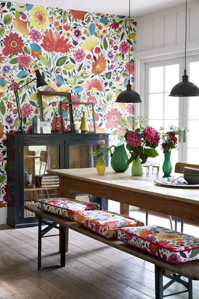
I like the colorful wallpaper in flowers and leaves. Would like valance or curtains as well. How can I find out
I like the bold colored wallpaper in the kitchen. How do I order this?
Hi Debbie, if it is still available, it will be on the Clarke & Clarke website. It’s lovely isn’t it?
I like the wallpaper that is in the first picture, floral, colorful and is in a dining room with matching seat cushions. How do I order this wallpaper?